Friday, May 7, 2010
Final Project
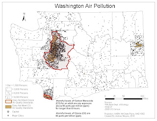
This map is a dot density map for Washington State. Also added are two layers that show air quality information for Ozone (O3) and Carbon Monoxide (CO). It is easy to see the correlation between population density and the areas of poor air quality. This map is intended to be used by the general public and officials in Washington State’s Department of Ecology. The local residents may use this map to see if the area they live in is polluted and people who plan on moving may use it to decide on an area to live in. The data was gathered from the Washington State Department Ecology, so it would useful to people in that department to see the correlation between their data and the population distribution of the state.
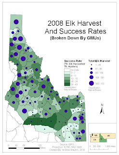
This map is a map showing hunter success and number of elk harvested in Idaho Game Management Units (GMU) during the 2008 hunting season. The data for the map was gathered from Idaho Fish and Game’s (IDFG) website. This map will be useful for hunters and wildlife managers. It will help hunters decide on a unit in which they may want to concentrate their time and effort. For wildlife managers it will help them see which units are producing the best elk hunting opportunities. They may then decide to study this area and see why it is so productive for elk and if they can copy these conditions in other units.
Wednesday, April 28, 2010
Map of The Week 4-26-2010
Proportional Symbol Mixed With Chloropleth Mapping
In this map I used proportional symbol mapping to show the number of people age 18-21 and chloropleth mapping to show the proportion of white persons out of the total population. In the proportional mapping section I used a minimum value of 1.40. I also put a black mask around the circles to help them stand out better. The directions told me to use the ‘proportional symbols’ symbology (and I did use this), but next time I think I would prefer to use the ‘graduated symbols symbology. This is because you can control the minimum and the maximum dot size. In my map I would only control the minimum size and the maximum size followed it. In my map I think that the minimum dot size is too small and the maximum dot size is about right, but I cannot control both. Aside from this issue I chose to use a horizontal legend format because it fit better in the available space than a vertical format. I chose the grey colors for the chloropleth mapping because they contrasted well with the green circles used in the proportional symbol mapping.
Proportional Symbol Map
In this map I used the proportional symbol mapping technique to represent the populations of different capital cities throughout the world. I chose a dot minimum size of 10 and a maximum size of 35 because this way the reader could see the smallest dot clearly and the dots started to coalesce as well. I also chose to use Flannery’s compression to help avoid the tendency of people to underestimate the size of larger objects. I used a vertical legend format because it best filled the available space.
Dot Map
In this map I chose to use a dot map to show the location of citizens age 65 and older. I used a mask to exclude dots from being inside national forest lands to make the location of the dots more accurate. I adjusted the size and value of each dot so that they coalesced slightly and were big enough to see when they were by themselves. I chose each dot to equal 75 persons because that is an easy number for people to work with that was close to the dot density I wanted for my map.
Sunday, April 18, 2010
Map of the week 4-12-10
Wednesday, April 14, 2010
Krging map: Rainfall in Idaho
Subscribe to:
Posts (Atom)