Wednesday, March 31, 2010
Quantitative Data Classification Schemes Map
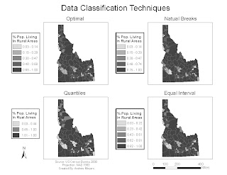 This map shows the affects of different classification schemes. Each individual map shows the percentage of people living in rural areas. The classification scheme for each map is labeled above it. Would choose the natural breaks method to represent this data because the data was skewed and natural breaks shows skewed data well. The optimal classification scheme also shows this data well, but it is much more complicated and time consuming to use in ArcMap.
Map of Boulder, CO using Macromedia Freehand
 Above is the improved map and below is the original
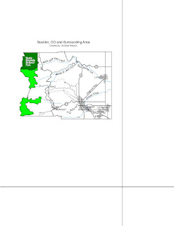
This map was made using Macromedia Freehand. It allowed me to have more freedom with labeling, but overall I didn't like the difficulty and tediousness of the program. It may be difficult to see, but the only changes I made to this map were to add more labels. I also changed the style of the labels to what is commonly seen for each feature. For example I made the river labels in Times New Roman italicized font.
Generalization Map
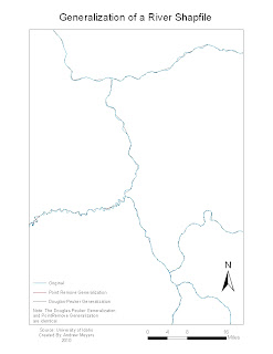 Above is the improved map and below is the original
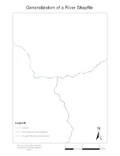
This is a map showing different algorithems used to generalize a river shapefile. I happened to choose two different algorithems that look exactly the same. To improve this map I removed the word legend and moved the river so that it cover more of the page. I considered showing a zoomed in inset map to show the minor differences of the two algorithems, but when I found out the showed the same thing I simply noted it in the map below the legend.
Quantitative Map
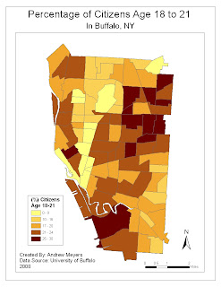 Above is the improved version of this map and below is the original
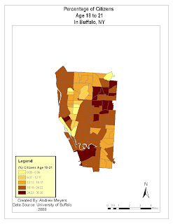
For this quantitative map of young adults in Buffalo, NY I first changed the data classification scheme from equal intervals to natural breaks. I did this because the data was somewhat skewed to the right and I felt this would better represent the data. I also made the legend more clear and concise by removing the word "legend" and reducing the number of decimal places. Finally I enlarged the mapped area to fit the page better and simplified the scale bar.
Tuesday, March 30, 2010
Qualitative Map
For this quantitative of racial groups in Buffalo, NY I enlarged the mapped area to fill out the page beter. I also made the simplified the scale bar and made the legend more clear.
Subscribe to:
Posts (Atom)


