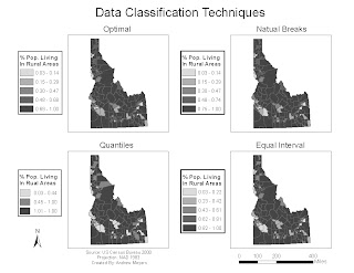
 This map shows the affects of different classification schemes. Each individual map shows the percentage of people living in rural areas. The classification scheme for each map is labeled above it. Would choose the natural breaks method to represent this data because the data was skewed and natural breaks shows skewed data well. The optimal classification scheme also shows this data well, but it is much more complicated and time consuming to use in ArcMap.
Wednesday, March 31, 2010
Quantitative Data Classification Schemes Map
 This map shows the affects of different classification schemes. Each individual map shows the percentage of people living in rural areas. The classification scheme for each map is labeled above it. Would choose the natural breaks method to represent this data because the data was skewed and natural breaks shows skewed data well. The optimal classification scheme also shows this data well, but it is much more complicated and time consuming to use in ArcMap.
Subscribe to:
Post Comments (Atom)
No comments:
Post a Comment