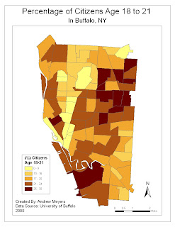
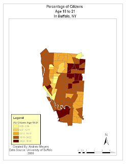
 Above is the improved version of this map and below is the original
For this quantitative map of young adults in Buffalo, NY I first changed the data classification scheme from equal intervals to natural breaks. I did this because the data was somewhat skewed to the right and I felt this would better represent the data. I also made the legend more clear and concise by removing the word "legend" and reducing the number of decimal places. Finally I enlarged the mapped area to fit the page better and simplified the scale bar.
No comments:
Post a Comment